Help Center
New Driver app
The driver app main interface will be resigned in the very near future (this change been delayed from 17th of April to 1st of May).
Now it is into an alpha version where we’re collecting the feedback from our partners and provides necessary time to inform the drivers about new upcoming changes.
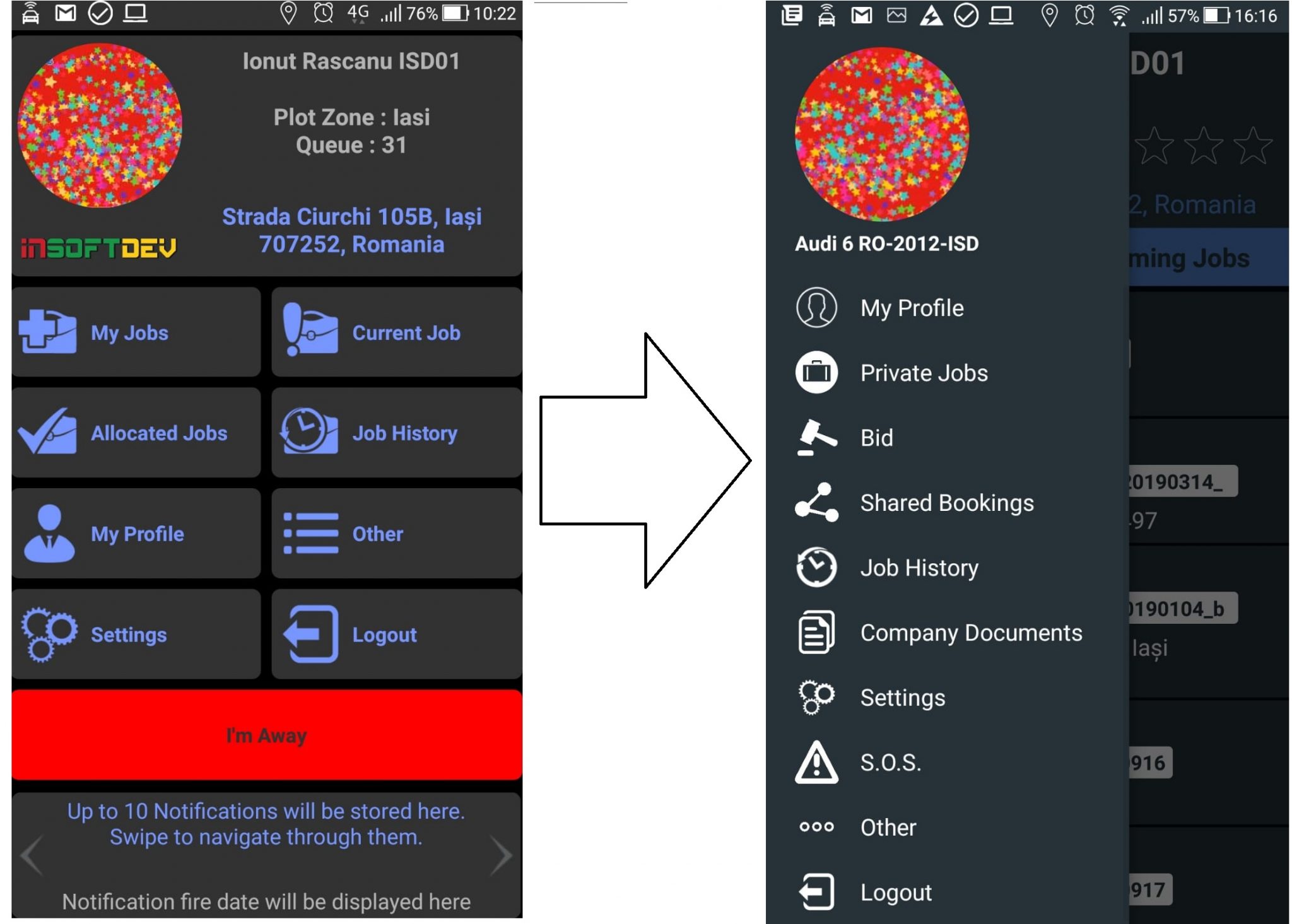
The base idea of this redesign is to improve to bring upfront the most common driver actions in one single view (in current version the information is spread along more menus) while leaving in background menu the actions are called less.
Main changes focus on the main page which will have a higher importance for all drivers actions, while we’ve tried to keep the look and feel, including most of the elements closer to what we have now to avoid a hard switch.
– the main menu is no hidden and can be accessed from top page button
– the new menu will have more direct actions can be accessed directly (e.g.: BID, SOS, Documents) ; in previous version such features been listed in Other main menu.
– the new version display the current vehicle the driver is logged.
– the driver picture been moved from main screen to the hidden main menu.
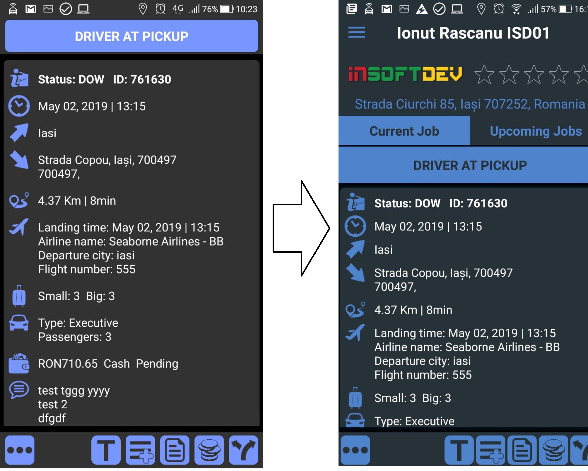
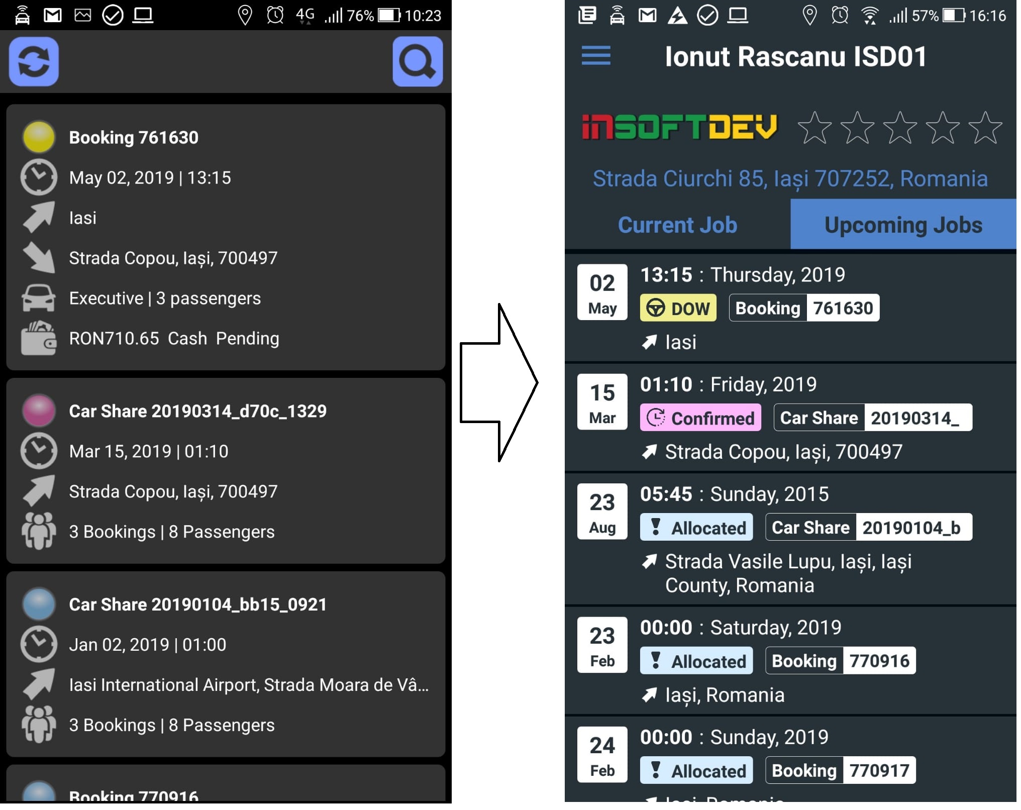
– the new version display the driver rating.

– in current version, the upcoming bookings been grouped under main menu Allocated jobs, while the Job in progress was under main menu Current job, so the work flow to accept a job, start and process required more steps. In the new version, everything (allocated jobs, current jobs, processing current jobs) is bring upfront, on the main driver page.


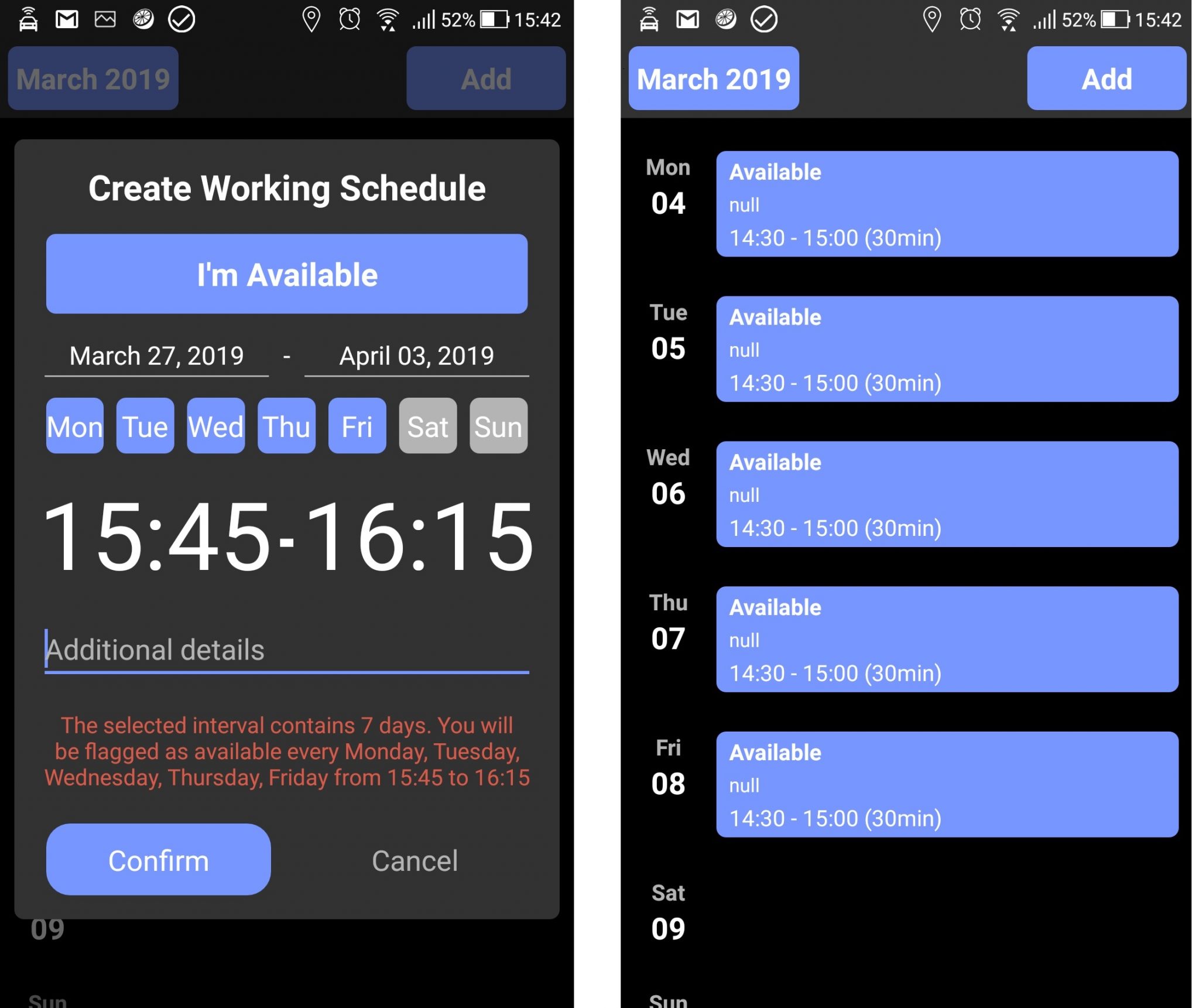
– Other important change will be the capability of the driver to set his own working scheduler directly from the app (My Profile – bottom page – Calendar button); see below some screenshots.
